 If you want to increase the ranking of websites, it is very important to optimise your website with a mobile-first approach. Only then Google will display your website/web pages in top search results.
When you use the internet through mobile devices, several problems come in your way. Slow loading speed of websites, no full view of the website or its material, poor downloading speed, etc, are some major problems. These troubles make users unhappy and cause a great loss to entrepreneurs who target business opportunities coming from small screens.
Are you a web-based business operator? Getting lots of complaints from your customer regarding your website functionality on mobile devices? Looking for easy ways to deal with the problem? If yes, go through this article carefully. Here, we will discuss some important ways to make the internet browsing better on mobile devices with Google AMP.
First of all, just have a look at some important technical terms to understand the write-up in an easy way:
If you want to increase the ranking of websites, it is very important to optimise your website with a mobile-first approach. Only then Google will display your website/web pages in top search results.
When you use the internet through mobile devices, several problems come in your way. Slow loading speed of websites, no full view of the website or its material, poor downloading speed, etc, are some major problems. These troubles make users unhappy and cause a great loss to entrepreneurs who target business opportunities coming from small screens.
Are you a web-based business operator? Getting lots of complaints from your customer regarding your website functionality on mobile devices? Looking for easy ways to deal with the problem? If yes, go through this article carefully. Here, we will discuss some important ways to make the internet browsing better on mobile devices with Google AMP.
First of all, just have a look at some important technical terms to understand the write-up in an easy way:
| Key Technical Terms | Brief Explanation |
| A Responsive Website to all mobile devices | It’s a term used by website designers and developers. They tend to create mobile responsive websites so that it can rank well in Google and help visitors to find your website easily on different mobile devices. |
| Website optimisation with a mobile-first approach | It's a website optimisation technique used by SEO professionals. They try to optimise websites in such a way that mobile users (as well as desktop visitors) can view websites easily on mobile devices. To do so, use only necessary design elements on your website and keep the content length concise as far as possible. |
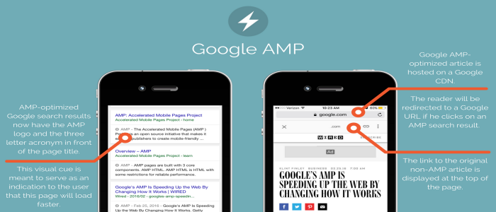
| Google AMP | Google AMP (Accelerated Mobile Pages) is the Google's gift to all entrepreneurs whose bread and butter comes from small screens. It allows them to make their websites appear quickly on all mobile devices. On Feb. 24, 2016, Google announced that it will consider AMP listing while displaying websites on mobile devices. |
Tips to improve mobile internet browsing with Google AMP:
Revamp Your Website at First
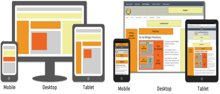
 All websites require renovation from time-to-time. It is because existing and potential visitors always expect something new and interesting from website owners. Therefore, you must revamp your website design ASAP. Just ensure that your website is fully responsive to all mobile devices. You can't perform this task if don’t have the knowledge of different programming languages and website building skills.
So, you must consult an IT company that offers website creation and renovation services at an affordable cost. However, if you run a website with CMS, use certain plugins/extensions to take your site to the mobile platform. For example- WPtouch. You can use this plugin to make your WordPress website responsive to all mobile devices.
All websites require renovation from time-to-time. It is because existing and potential visitors always expect something new and interesting from website owners. Therefore, you must revamp your website design ASAP. Just ensure that your website is fully responsive to all mobile devices. You can't perform this task if don’t have the knowledge of different programming languages and website building skills.
So, you must consult an IT company that offers website creation and renovation services at an affordable cost. However, if you run a website with CMS, use certain plugins/extensions to take your site to the mobile platform. For example- WPtouch. You can use this plugin to make your WordPress website responsive to all mobile devices.
Create the AMP Page for Your Website
 To create an AMP page for your website, you need to understand the basics of AMP at first. As a matter of fact, AMP is broken into 3 different sections:
| Types of AMP | Explanation |
| AMP HTML | It is a redesigned version of HTML. It contains a new set of custom AMP related commands. |
| AMP JS | It is a new Javascript structure for mobile pages. It facilitates the loading of external resources asynchronous. |
| AMP CDN (Content Distribution Network) | It takes the AMP-optimized content and cache them. It allows visitors to get the content quickly on mobile devices. |
Create AMP-Optimized Content
 Creating an AMP page for your website alone is not sufficient for meeting the needs of mobile visitors. You need to create AMP-optimized content in bulk. Just keep the content length precise and straightforward. The content should contain an actionable and engaging headline and the original image. First 100 words of the content should be compelling. It will encourage visitors to be a part of your lead generation process and give lots of business opportunities to you.
Optimise Google AMP Pages for Organic Search Results
 All website owners always keep in mind that AMP is not a ranking factor at all. It is only seen in the News carousel. Google gives a great importance to the News carousel above-the-fold on mobile. So, you can miss lots of business opportunities if you are not on AMP. Therefore, you must optimise AMP pages with the latest SEO tricks. This will help users to find your website/webpages in mobile search results.
Pay Attention to AMP Ad placement
 There are many website owners who use premium advertising campaigns to get instant results in the web-based business. If you want to work on AMP ad placements to get more page views and business opportunities. Get ready for more competition.
Just choose the right ad forms when you place ads on AMP pages. Try to make ads in AMP innovative and engaging. Provide support to AMP ads from broad market landscapes and use HTTPS. This will increase the performance of AMP ads up to a great extent. You will be able to ensure a great ROI in an easy way.
There are many website owners who use premium advertising campaigns to get instant results in the web-based business. If you want to work on AMP ad placements to get more page views and business opportunities. Get ready for more competition.
Just choose the right ad forms when you place ads on AMP pages. Try to make ads in AMP innovative and engaging. Provide support to AMP ads from broad market landscapes and use HTTPS. This will increase the performance of AMP ads up to a great extent. You will be able to ensure a great ROI in an easy way.
Use Google AMP For Local SEO
 A good number of entrepreneurs do business with local clients rather than international customers. Even Google tends to choose websites/websites that are optimised with local SEO when it has to show authentic results to visitors in a particular domain. If you don't optimise your AMP pages for local results, don't dream about enjoying its benefits. Just optimise your AMP pages for local search results. Take the help of an expert SEO firm if you are unable to do that.


