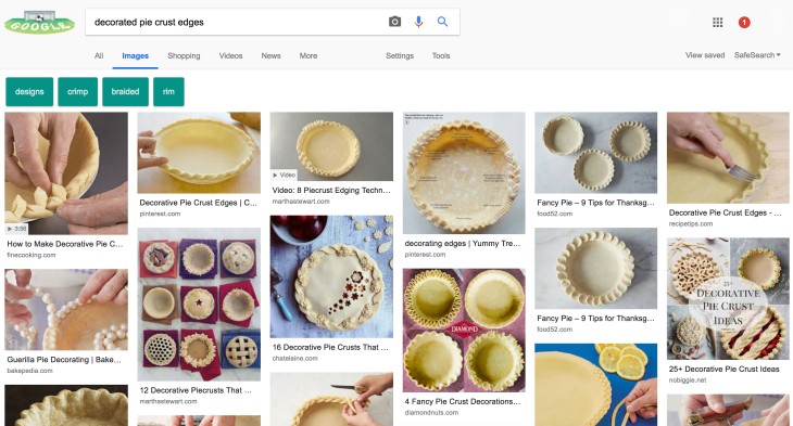
Google has finally unveiled a new interface for its image search results pages after a month or so of testing. The new interface displays images in bigger boxes, with corresponding details and relevant images. The search bar also shows related terms or keywords searched alongside the keyword you used.
Users need not scroll through the details to see more images. The new system keeps image previews to the right side and remain there as you scroll.
How the new interface appears. As you can see on the featured image above, that is how the new Google Images search results page looks like.
Previous interface. In case you forgot how the old interface appears, please see below:

Testing Phase. Google has been simulating variouspreview box styles in the image SERPs for quite some time now. You can visit Google’s Development site for more information about their testing activities.
Significance of the New Image Preview Box. Like the regular Google search engine results pages, image SERPs are powered by algorithms. Any change in image search algorithms can also affet the ebb and flow of traffic to your web site. It is therefore important that you monitor your website in the next few days. Are any of your website images appearing on Google Image search or are they no longer to be found?
Note. The feature is is now fully functional. Google has confirmed its official launching on their blog. Stay tuned and be vigilant for new updates.


